Design System, Style Guide, Prototype, Enterprise UI


My achievement in this role.
During this role, my key achievement was building a design system that unified workflows across B2B consulting projects, enabling consistency and efficiency at scale.
🔄
⚡️
🪄
Background
When I joined, we’ve just gone through a merger and transitioned as an IT consulting firm. My mission is to unify the fragmented UI patterns and build a design system.
It was an exciting time, but also a moment of transition. With a refreshed brand identity came a familiar challenge: multiple legacy products, each with their own look, tone, and UI habits.

New Branding, New Look
Ensure consistency across products and client materials.

Faster Client Demos
Speed up prototyping and shorten feedback loops.

Handling Complex B2B UIs
Provide reusable patterns for form-heavy, data-driven interfaces.
Observation & Insights
Through analyzing three major product lines, I looked for recurring patterns and core interface needs.
Product 1: Financial AI Agent

Product 2: Legal Contract Dashboard

Product 3: Data Consolidation

Finding 1: Shared Components
Identified 13 frequently used components across products, providing clear opportunities for standardization and reusability.
dropdown
Please select
text input/area
Text Area
search bar
Search
upload
Click or drag file to this area to upload
Document.docx
1.2MB
Document.docx
1.2MB
Finding 2: Forms & Tables across 70% UIs
Across all products, forms and data tables were the backbone of workflows, essential for input, review, and decision-making in B2B contexts.
Form


Data Table

Turning insights into action 🪄
With a clearer understanding of our products and users, I began shaping a plan — one that would help us reconnect our visual language and work more smoothly together.
1
Align typography, color, and spacing rules to unify the new brand identity across all products.


2
Consolidate the 13 frequently used components into a reusable, consistent library.


3
Build Form/Table Template
Create flexible templates for forms and tables, enabling efficient customization for complex B2B workflows.


🧩
Applied Design Tokens

📝
Defined Usage Guidelines & Best Practices
I documented step-by-step usage for specific components, ensuring consistency and reducing ambiguity when scaling.

🛠️
Listed Controlled Properties & Variants
I mapped all states, sizes, and variants for each component, ensuring flexibility while keeping consistency.


Form/Table Templates
Next, I focused on data tables and forms, the interfaces that mattered most in our B2B product and where we spent the majority of our time designing the workflow UI.
Once the component library was in place, forms and data tables became the top priority. They powered nearly every workflow, so I designed adaptable templates that improved consistency and supported the complexity of our B2B use cases.

Data Table

Form

Deconstructing tables into clear building blocks
I first broke down existing tables into their essential column types.
Format (1st column)
Data Attributes (middle columns)
Actions (last column)
This analysis gave me a clearer foundation to define how each row should behave and how content should be structured.
Defining cell-level control
A table is ultimately a collection of many cells. To manage them consistently, I introduced two levels of control that define what a cell displays and how it behaves across different table types.
🗂️
Content Control
Each content cell can be composed of three types of elements: text, tags, action buttons. This ensured every cell could be assembled in a consistent, predictable way, regardless of the table’s complexity.

⚙
Format Control
The first column of each row determines the structural behavior of that row, such as “Whether the row is expandable”. This layer of control ensured the table not only showed data, but also supported deeper hierarchical workflows common in B2B products.

Usage Demo
Flexible table template unifies cell controls and can be quickly adapted to different use cases.
Form/Table Templates
Similarly, I deconstructed the enterprise form to understand the core structures.
A typical form is built from three essential parts, title, content, and footer. Across products, these elements stayed consistent, even though layouts varied widely. This allowed me to create a unified structure.

🏗️
The base layout for all modular form templates
single column

double column

Building a modular, adaptable form system
I designed a modular form template that can scale from simple forms to complex, multi-column enterprise workflows. Each element is flexible, allowing teams to mix and match layouts based on client requirements while keeping the UI consistent and easy to maintain.
Form Title
The form header includes the main title and optional description that provide context and set expectations for the user.


Content Sections
Each section allow designer to insert and rearrange different field types, while keeping spacing, alignment, and column layout consistent.


Footer
The footer hosts key actions such as “Save,” “Cancel,” or custom operations. Choose from multiple footer layouts and button alignment options to fit different workflows.


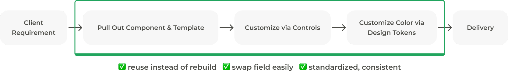
Usage Demo
Instantly swap form fields via dropdown and adjust the label with flexibility
By building the design system, I transformed the team’s workflow, creating 134 reusable components and increasing design efficiency by 36%.
Old Workflow